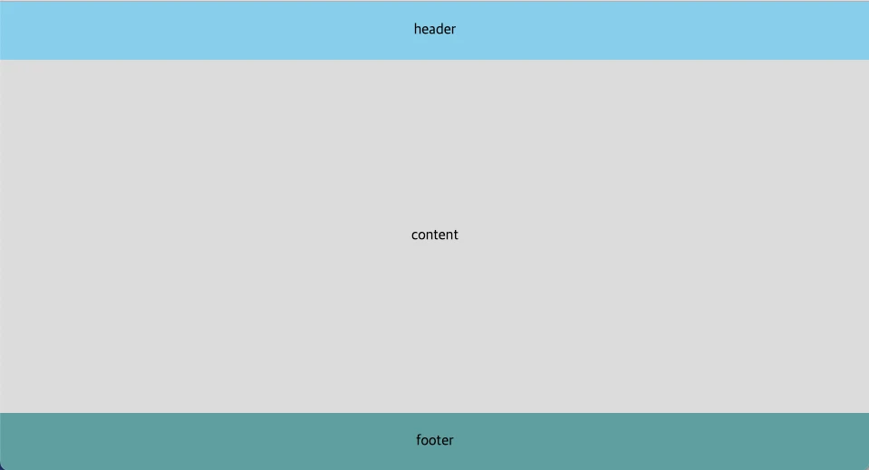
footer 하단 고정하기 with flex
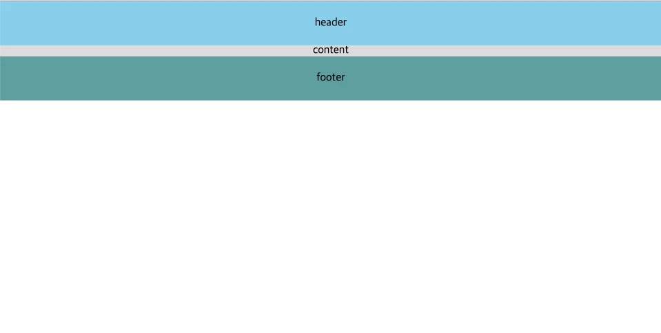
컨텐츠의 높이가 viewport를 넘으면 footer가 자연스럽게 화면 하단에 배치되지만, 컨텐츠의 높이가 viewport를 넘지 못할 때는 footer 아래에 빈 영역이 나타나게 된다. display:flex와 flex:1 속성을 이용하면 컨텐츠의 높이가 viewport보다 작아도 footer를 화면 하단에 고정시킬 수 있다.
구현
<!-- html -->
<body class="body">
	<header class="header">header</header>
	<section class="section">content</section>
	<footer class="footer">footer<footer>
</body>
/* css */
.body {
display: flex;
flex-direction: column;
width: 100vw;
height: 100vh;
}
.header {
width: 100%;
padding: 24px;
text-align: center;
background-color: skyblue;
}
.section {
display: flex;
justify-content: center;
align-items: center;
flex: 1;
background-color: gainsboro;
}
.footer {
width: 100%;
padding: 24px;
text-align: center;
background-color: cadetblue;
}핵심은 컨텐츠를 감싸는 요소에 display:flex를 설정하고, 화면 비율에 따라 유연하게 요소의 크기를 늘이거나 줄일 수 있는 flex:1 속성을 컨텐츠 요소에 적용하는 것이다.
그 결과로, body 요소에서 header와 footer를 제외한 나머지 여백을 컨텐츠 요소가 전부 채워 footer가 항상 하단에 위치하게 된다.
flex: 1에 대한 자세한 설명은 이 링크를 참고하면 좋다.
실행 화면
flex: 1 적용 전
flex: 1 적용 후